How to Choose the Right Color for Your Marketing Message
Put the power of color to work for you
When you hand out a piece of marketing collateral or send a direct mail piece, the first thing recipients notice is the color. In an instant, color grabs attention, highlights areas of importance, establishes credibility, enhances your message, and (when particularly high quality)… distinguishes you from the competition.
Used correctly, color is a powerful way to elicit emotion. Consider the feelings that each color represents and use it in your images, text, and design elements to really drive home your message.
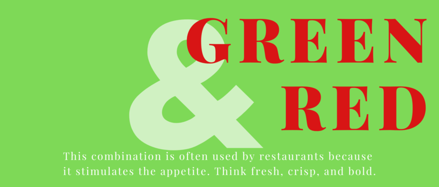
RED conveys excitement, energy, and passion while also portraying anger and seriousness at times.
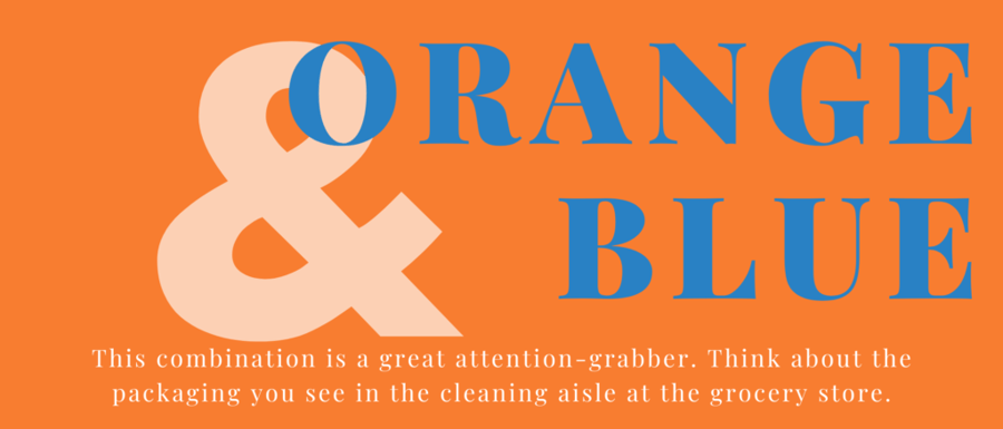
ORANGE brings out joy, warmth, enthusiasm, creativity, and success.
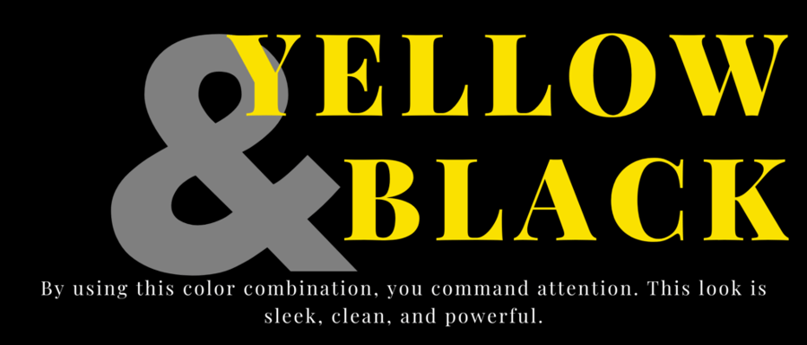
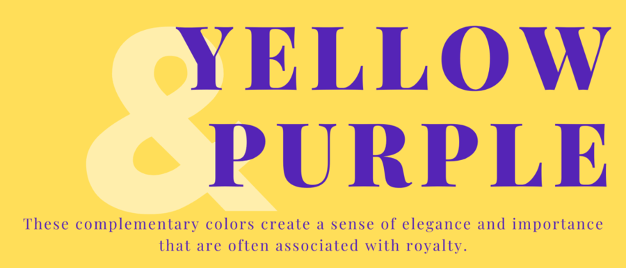
YELLOW is happy, optimistic and hopeful, but also cautionary depending on the use.
GREEN is relaxing, symbolizes safety, comfort and the environment, but can also convey judgement and greed.
BLUE is cool and authoritative, as well as peaceful. It can be used negatively to show feelings that are depressed and passive.
PURPLE shows imagination, luxury and mystery. It can also be used to show sensitivity.
BROWN is simplicity, reliability, and protective. You can use it to show sadness and dullness also.
BLACK is often used in design to be powerful and sophisticated. It is also dominant, dark, and pessimistic at times.
WHITE is clean, elegant, fresh, and is an excellent color to pair with your designs. It can also portray loneliness and emptiness if you need it to.
So, whenever you are designing your next marketing piece, make sure your color palette is consistent with the message you wish to convey.
What do specific color combinations mean?
Need to make sure your printed color is accurate?
When assigning colors to your printed pieces, remember that the color you see on your computer may not appear identical on the final printed piece.
Images on your monitor are displayed using RGB colors, or those produced by combining red, green, and blue. Offset and digital presses produce color by blending cyan, magenta, yellow, and black (CMYK), so unless you have a color management system, the color you see on your monitor may not match exactly what you see in print.
How can you make sure your color is correct? Request a proof! We are proud to be G7 Certified, which means we test and validate our print and color capabilities to the highest level of global industry standards and specifications each year.
If color is critical, make sure to request a hard copy press proof before you approve the job.
Aradius Group is a commercial printing company that specializes in marketing strategy, specifically with direct mail, based out of Omaha, NE.